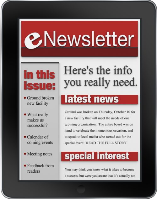
 Have you noticed what great business newsletters have in common? They’re easily scannable; that is to say, you can easily scan the newsletter to determine the topic, the key message and what action the writer wants you to take.
That’s why newsletter design is so important.
I’ve been writing about business newsletters (relevancy and branding), and great newsletters also have a lot of thought put into design and layout.
When readers receive your newsletter the first time, is it easy to understand what it’s about? Is it easy to read? And is it easy to find information they’re looking for? Or, do they get distracted by too many words, images or stuff, so they flee?
Here are five newsletter design must-haves that will help you get found, get known and get clients.
- Allow for white space.
White space is created by:
- Short sentences
- Short paragraphs
- Only one space after a period ending a sentence
2. Organize your newsletter to make it easy to scan.
Many people read newsletters in a hurry, so help them out:
- Use sub-titles and sub-headings
- Use bulleted lists and number lists
- Use the body of the email to introduce the newsletter, and include the entire content in a clickable link document or webpage so the email is only 2-3 paragraphs long.
3. Build trust with your readers.
Use the following elements so your readers can get to know you.
- Photo – a professional photo is preferable to a family shot
- Bio on the back page or sidebar
- Use the first person personal pronoun “I”
- Write in a conversational way, avoid using a formal 3rd person impersonal business bio
- Testimonials:
- Put on a separate, stand alone page and include a link
- Or put in a side-bar
4. Make it easy for readers to subscribe
- Include a subscribe link in the body of your email, and invite your reader to forward it to others with effective feedback/forwarding options.
- Automatic unsubscribe instructions
- Option to reply directly to your inbox so you don’t miss opportunities to respond directly to readers’ inquiries
- On your blog or website:
- Use an email subscription form through Feedblitz.com or Feedburner.com
- RSS feeds: can extend the reach through Feedburner.com
- Include a list of related newsletters or blog posts so people can read further when they like a topic.
- Make it easy to find content on your blog. Here are some important tips to help organize your blog posts:
- Categories – make sure this is enabled and that you assign every post to a category (makes it easy for readers to find specific content)
- Try to limit the number of categories to 10-12 as anything more becomes confusing.
- A page with links to top posts, then create a sidebar list
- Descriptive headlines with keywords – helps people to find specific topics and content useful to them
- Use descriptive words in your links, not “click here”
5. Create a template.
Your readers will benefit from the consistency, and it will save you time.
- Many online newsletter services provide templates you can choose from – just be sure incorporate your graphics, colors, etc. to make it unique and reflect your style/brand. If you are using an online provider, like MailChimp, ConstantContact, Aweber or other service, be sure to consider how you will manage your database and keep your contact information private. I’ll talk about that more in another post.
Want to know more about business newsletters? Click on the video on the right hand side of the blog that says “Newsletters 4 Leaders“…
In the meantime, let me know what elements you think make up the best newsletter. I’d love to hear from you, contact me here.


Recent Comments