 How should content marketing be used on the home page of your website? What makes good website copy? More specifically, if you’re a professional service provider, like an executive coach, a consultant, a lawyer, health care or financial adviser… how do you create a website that attracts clients and gets potential new leads?
No matter what business you’re in, your content must achieve 4 things. Here are 4 goals of your online content:
- Connect immediately (by speaking to your readers’ challenges or problems)
- Answer questions and educate (by suggesting solutions)
- Provide choices without confusion (by providing 3-4 places to read more)
- Compel readers to take action (simple sign-up form or contact link)
That’s a basic outline that you could follow, not just for websites, but for your blog and other content marketing pieces.
Let me give you a great example so that these 4 goals come alive:
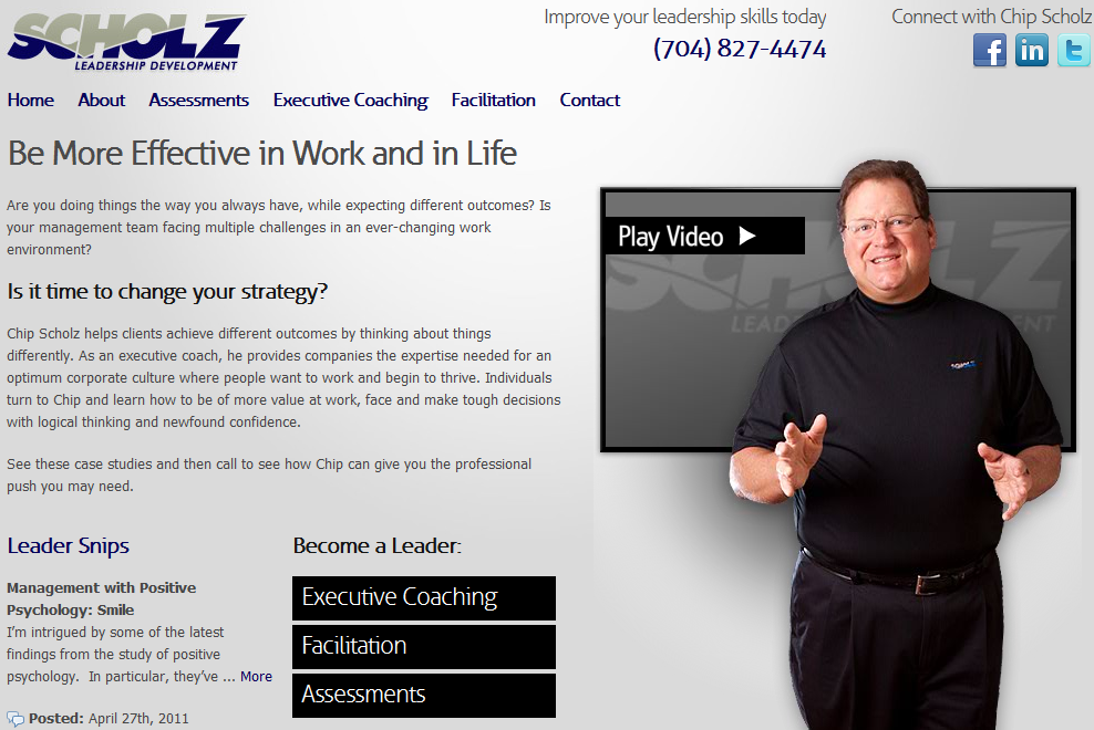
Here’s a screen shot of the newly revised website for ScholzandAssociates.com. Chip Scholz is an executive coach. His previous website was well designed, but it had too much information, in my opinion.
Like other executive coaches, he offers many services: facilitation, assessments, leadership development, speaking and books. The challenge is to present all the services to readers, while maintaining the focus on them and their problems.
I think this site does a good job because it’s about the outcomes and benefits of coaching. It backs that up with case studies from Chip’s clients. It’s brief and to the point: 
Notice the headline, Be More Effective in Work and in Life. That is a primary outcome of coaching. So instead of “selling” coaching and trying to explain how coaching works, this home page focus is on what his readers and clients want for themselves.
In the subtitled section, “Is it time to change your strategy?” he further elaborates on the problem: trying harder yet getting the same results.
Then he offers three ways he can help people become a leader: through coaching, facilitation and assessments. It’s clear you can click on each one to find out more. Sure, those options are also offered in the navigation bar, but people tend to ignore that and read what’s on the page first.
Chip also makes good use of video. He knows full well that nobody’s going to contact him without first feeling some sort of connection. So the video gives a sampling of what it’s like to see and hear him.
This is just the home page. The subsequent pages have client stories and case studies which further bring to life the work and outcomes of Chip and his business.
Throughout, there are offers to contact by phone, through social media, and his newsletter. To me, this coach site is just right – not too much information, it’s brief, clear and focused on outcomes.
I interviewed Chip to find out why he changed his website, what were his goals, and the “back-story” of this revision. Here is my interview with him.
1. What factors made you decide to change your site?
There are a number of reasons:
**My old site was 7 years old, and technology has changed. The old code behind it wasn’t effective in being picked up by the crawlers.
**I had cobbled together the content from a bunch of different sites, and it was really stale.
**I had a lot more clarity about what my business does, and it needed to be reflected on the site (the case studies are a great add).
**The old site wasn’t social media friendly.
**I am very proud of my blog, and it needed to be more fully integrated into the website.
**Finally, the big reason…I lost weight since the pictures in the 04 site were taken, and needed to reflect the look!!
2. Did you have specific desires and goals? What were they?
My business goals are much clearer and I needed my site to reflect that, and I wanted all new, original content.
3. Did the people you hired make most of the changes?
I approached them, but they were VERY helpful in providing suggestions, and did a GREAT job on helping me focus the site.
4. What content did they ask you to contribute? Did they get involved in the content/marketing, or did they primarily focus on the structure and design?
Flying Bridge Technologies (FBT) is the firm I have been using for the last 7 or 8 years…they did the last two iterations of my site. They are getting much better at the marketing end, not just the tech end.
They did have outside resources to complete many of the tasks. For instance, Aprill Jones wrote most of the content based on our suggestions. Aprill is a freelance writer here in Charlotte that FBT suggested.
The video on the home page was shot and edited by 1060 Creative, another company suggested by FBT. It was a 6 or 7 month project, and there were a lot of moving parts. Add to it that I travel extensively, and it all came together quite nicely.
5. What advice would you have to others looking to change their web site pages?
Get a great firm to work with, like FBT, and open your wallet! It isn’t cheap to have a cool site. This one came in around $11K when you add all of the subcontractors, etc.
Unless you are great at content creation, hire someone to do it.
Oh, and have a GREAT blog, posted consistently.
Patsi: Thanks, Chip, for sharing your process and insights. Of course, I fully agree with you that quality content and design should be outsourced and isn’t cheap. But it’s an investment that pays off over time.
If you offer quality services to your clients, then shouldn’t your web presence reflect that? As they say in one of those television commercials for beautiful skin… “You’re worth it!”


Recent Comments