 Lately I find myself building pyramids. Not real ones, but the kind you can do in Microsoft Word docs. I use them to illustrate a point in an article or blog post. Content marketing with visuals makes your piece clearer, and more compelling to the readers.
Here’s what I’ve designed in just the last few weeks, and it isn’t stopping. (See end of this post for the pyramid drawings.)
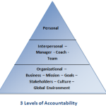
- First it was the “3 Levels of Accountability” pyramid.
- Then, I was writing about life planning so I did a “Life Plan Pyramid.”
- And for my article on The Quest for Better Teams, I created a triangle with the “4 Elements of Effective TEAMS.”
What’s up with that? Naturally, since I’m finding myself obsessively drawing charts and triangles, I checked to see if I’d gone off my meds. No. I’m just on a visual kick. Why write paragraphs of text when a doodle says it all?
Apparently I’m not the only one to think this way. A quick research on Amazon and I discovered a trend touting the benefits of the “Visual Revolution:”
“Visualization is a doorway to insight about your own visions, strategies, and implementation plans. It is a path to appreciating the interconnection and wholeness of things.” David Sibbet, Visual Leaders, Wiley 2012
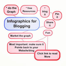
I’ve written about using images and diagrams and such for blog posts before. And there’s a lot that’s been written about the value of quality content, accompanied by animation and great visuals. But now I’m discovering the psychology behind this trend. Graphic images that illustrate articles and blog content are more than eye-candy to attract readers, much more.
Visual tools help in these ways:
- People learn and change when they become engaged in the process.
- Processes are easier to understand through drawings.
- Drawings help both the author and the recipient make connections.
- Metaphors and maps transform data into meaning.
- Images connect and involve the whole system.
- Many graphics can be used as templates to allow the reader to interactively participate.
The Egyptians had a whole system for communicating with little pictures or hieroglyphics. They apparently understood what academics and theoreticians have a difficult time with: Simple is better.
The younger generation doesn’t have patience to read through text and I’m not going to debate that. The use of quality images can make communications clear, meaningful and memorable in ways that text cannot. What’s been your experience using drawings and images?
P.S. I highly recommend Sibbert’s books! Egyptian image: Freedigitalphotos.net.
