Archive for landing pages

Landing Pages: Get Readers to Take Action

How do you get readers to take action? Short answer: a landing page. (Also known as a sales page, squeeze page)

You can’t get results from all the content you’re creating and publishing on your blog, e-newsletter, social media sites, unless eventually you send people to a landing page and ask them to take action.

Otherwise, you may be creating a great brand, great thought leadership, great content… and so what? Sooner or later, you need to ask your readers to actually do something. You need a landing page to do that.

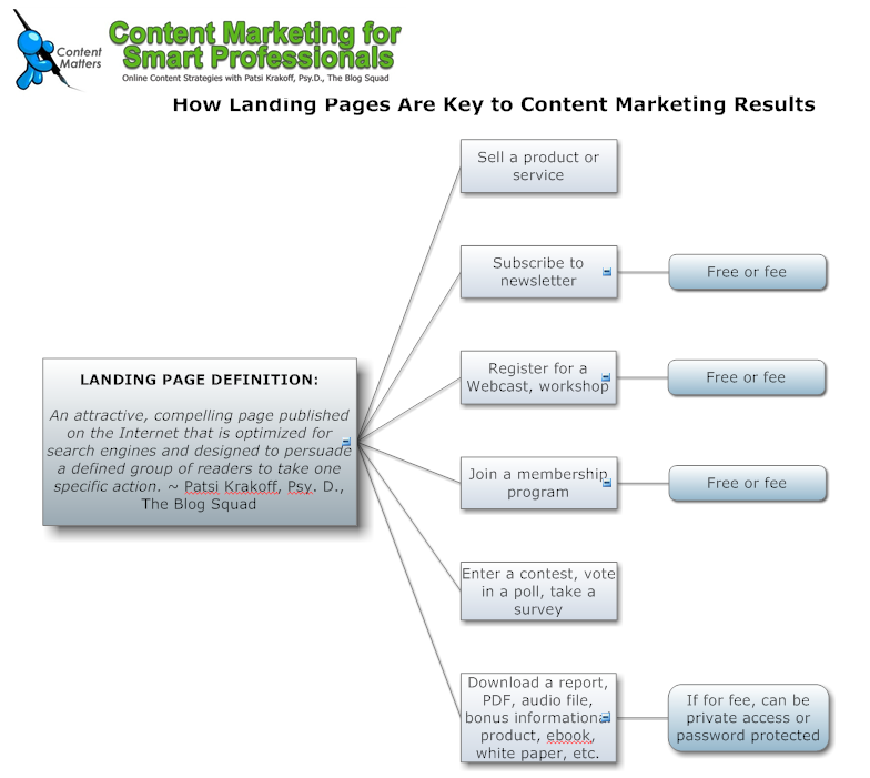
Landing page definition: An attractive, compelling page:

  • Published on the Internet that is
  • Optimized for search engines and
  • Designed to persuade a defined group of readers
  • To take one specific action

Here’s what I created (yes, again with the Smart Draw) to illustrate:
Read More→

Video: How to Create Great Sales Pages in WP

Here’s a quick video I’m  using to promote Suzanne Bird-Harris’ fabulous WordPress Sales Page Template.I love the image of the “web designer thief” that sneaks across the screen about half way through… 😉

Take a look, and if you haven’t downloaded the free audio interview and transcript we did together, go to PatsiPicksWPSalesPage.com and do so now.

What do you think about the video? I think the folks at iFlashVideo.com did a super job!

I want to share with you this nice email I got from Kathy Porter, who was on the actual teleseminar call:

“Hi Patsi – your webinar training on how to incorporate a sales page into a WordPress platform is one of the BEST things I’ve participated in this year.  (I’ll be creating my own WordPress blog shortly, now that I’ve gotten my feet wet using Typepad.)

Think I can help you expand your reach with this product by tweeting and “face-booking” your affiliate link as my heartfelt thank you for making this info available.”

Kathy Porter
Creator and Owner, MrsBizWhiz
Web site/blog: www.MrsBizWhizConnects.com

How to Make Social Proof Work Online

Do some client recommendations work better than others? Social proof is such a strong trigger for online action, it’s good to know what works best for your Web content marketing strategies.

In a previous post, What Clients Say, I reported on research that showed people selected travel destinations 20 percent more with a client recommendation and a photo of the reviewer.

Research studies show that some ratings and reviews will influence more than others: This report is taken from Dr. Susan Weinschenk’s book Neuro Web Design: What Makes Them Click:

  • We are most influenced when we know the person and the person is telling a story. But quite often, it’s unlikely we will actually know a person doing an online review, unless they are a well-known author or respected expert in the field.
  • We are somewhat less influenced when we don’t know them, but we can imagine them because their is a name, a company name, a link to their site, and maybe a persona description of them (like, for example, a stay-at-home mom, a runner, a CEO, a Ph.D.) Read More→

8 Ways to Use a WordPress Sales Page

Do you know how many ways a sales page can be used? I woke up thinking about this… because maybe you don’t think a “sales page” is something you need except once in a while for a product launch, when you’re trying to sell something.

Some people call them landing pages, or squeeze pages. I think the term was meant to squeeze your email address out of you, how weird is that? So let’s be clear about what kind of circus animal we’re going to be training to sit up and do tricks on our free teleseminar this Thursday.

Thursday, June 24, 2010 at 4 p.m. ET I’m interviewing Suzanne Bird-Harris on how to use a WordPress platform to create great sales pages. We’ll talk about format styles, different ways to use a page, and key elements that work to build trust. If you can’t attend, you will be sent the audio file and access to our power point presentation, if you register. You can register here:

Name
Email

Here’s my definition of the sales page beast: an attractive, compelling page published on the Internet that is optimized for search engines and designed to persuade a defined group of readers to take one specific action. Read More→

Rant: The Problem with Formatting Sales Pages..

Even when you’re giving something away, for FREE, you’ve got to write good “sales” copy that spurs people into action. In today’s info-crammed world, that means you’ve got to grab busy peoples’ attention, and get them to click, and get them so excited that they take the time to type in their email address in exchange for your offer.

Unless you’re Naomi Dunsford of IttzBiz and know how to skillfully weave obscenities into headlines or emails, what cha gonna do? There are Internet gurus who’ve made millions teaching us lowly common folk with Ph.D.s how to sell socks to centipedes.

Entire Web fortunes have been made. Bare with me, I’m just getting started with this rant…

You think you’ve written a fairly decent sales letter, you’ve got all your benefits, your “AIDA“… (you’ve remembered to grab Attention, gain their Interest, spark Desires, address objections and ask for Action – with a sense of urgency, of course  – but you’re far from done.

The fun is just beginning. Now you’ve got to format your sales letter landing page, with a dynamite headline, cool graphics, arrows, ORDER NOW! buttons, subheadings, testimonials, bonuses…

Ay, ay, Chihuahua! (as we say down here in my home town of Ajijic, Mexico.)

Creating Great Sales Pages Read More→